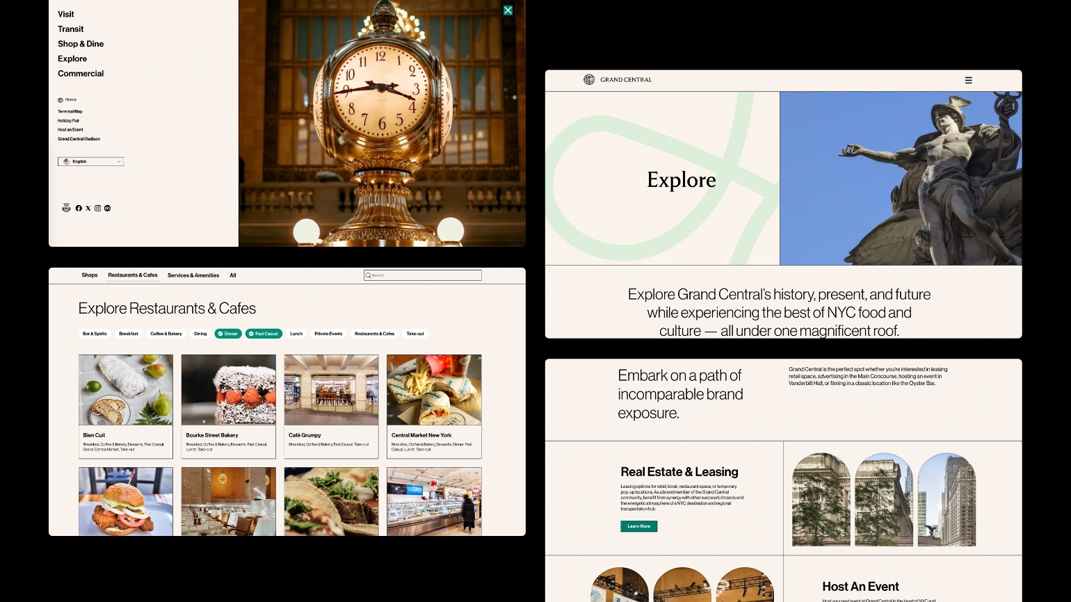
Grand Central Terminal
Repositioning the iconic historical institution through brand & campaign
New York, United States
Branding, Design, Web & UX, Campaign

Repositioning the iconic historical institution through brand & campaign
New York, United States
Branding, Design, Web & UX, Campaign

Grand Central Terminal’s marketing needed a fresh vision, a bold new look, and a revitalized positioning to modernize its brand, unify messaging across stakeholders, and enhance its appeal as a destination.
The brand essence of “Everyday Grand” helped to contextualise the place-making and place-branding requirements. Grand Central is a space that thousands of New Yorkers transit through everyday, and millions of people visit on their vacations to New York. The brand, messaging, and marketing materials had to feel both casual and elevated to match the personality of the terminal.
For the refreshed brand identity, I drew inspiration from the buildings architectural grandeur. I crafted graphic elements such as frames based on the windows and Beaux-Arts architecture, patterns distilled from the art deco wall prints, and typographic features from the carved in stone typography found throughout the station. The terminal’s iconic constellation ceiling formed the base of the colour palette so that all marketing materials and signage felt at home with the architecture and space. The result is a modernized identity that feels like a genuine extension of this historic destination.


